Natural oak is one of those choices that feels effortlessly easy. It is warm without becoming overly rustic, light without feeling cold, and its subtle irregularities bring an immediate sense of comfort to a home. That versatility is exactly what makes it so appealing. It also makes it look deceptively easy to combine.
Then the questions begin.
White or beige walls? Can I introduce a walnut dining table? Which stone works best? Brass or black? And how do I stop the whole house from becoming an endless succession of wood, ecru and beige?
Let’s start there.
“Natural oak” does not refer to a single colour.
It can be very pale, almost sandy, or distinctly more golden. It may have visible knots or a very even grain. The grade of the timber, the finish, the width and format of the boards, and of course the laying pattern all make a difference.
Then there is the light. The same floor can feel beautifully neutral in the morning and considerably warmer under late-afternoon light.
Before choosing anything else, observe the oak in your own home.
And do something very simple: place the samples of paint, fabric, stone and timber you are considering directly on the floor. Look at them in natural light, then again in the evening with the lamps switched on.
It is one of the simplest — and most useful — tests you can do.
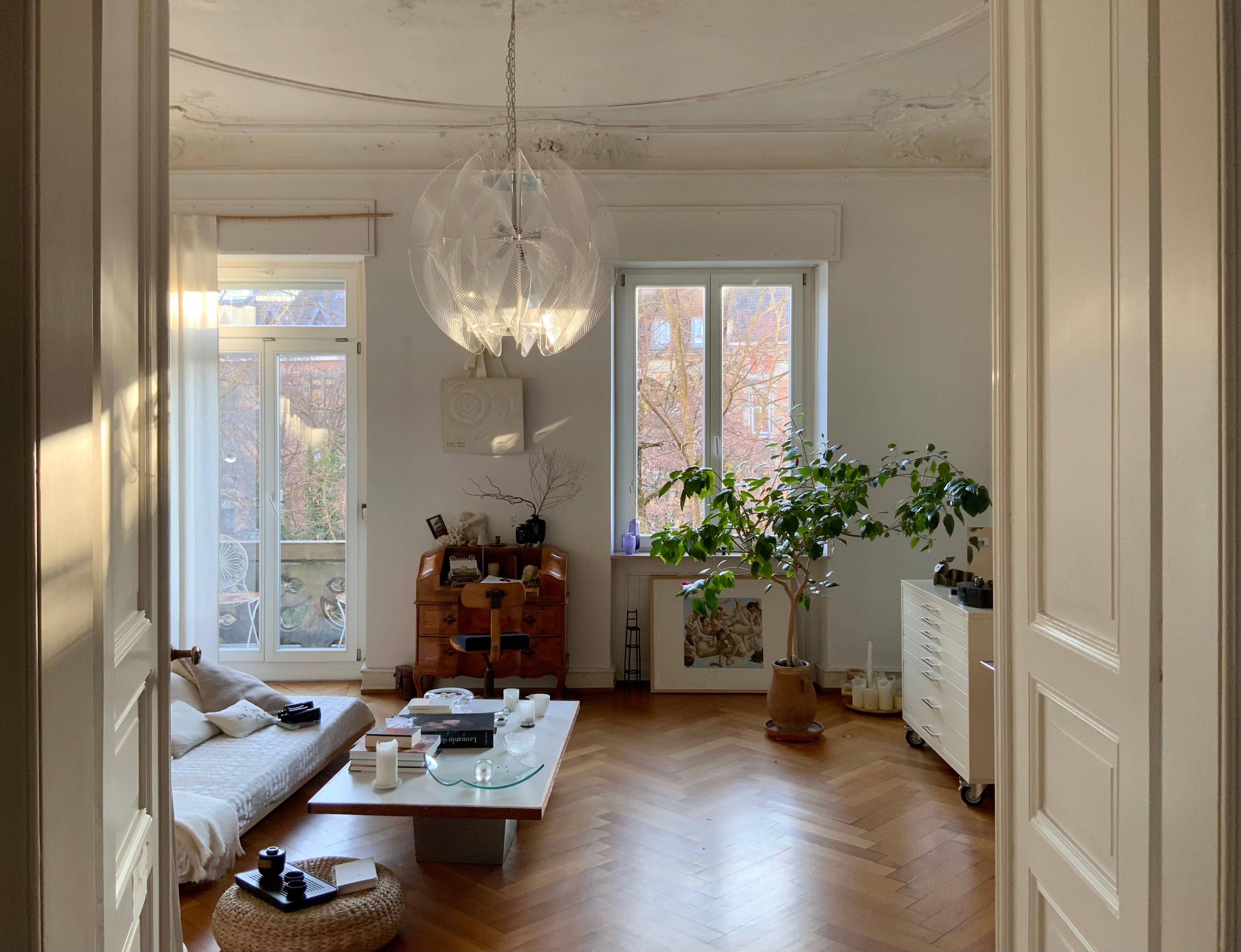
Natural oak. Ecru walls. Beige sofa. Linen curtains. A rope-coloured rug. A pale timber coffee table. On paper, it sounds impossible to get wrong. And yet this is exactly where many interiors begin to lose character.
Not because there is too much beige, but because everything sits at the same level of intensity. A neutral palette needs depth just as much as a colourful one does. Try introducing one element capable of creating contrast: a muted olive green, a deep blue, tobacco brown, a stronger stone, a walnut cabinet or a few darker accents. You do not need to add much.
Calm does not come from making everything the same colour. It comes from finding the right balance between quiet elements and those that give the room depth.
Absolutely.
One combination we particularly love is natural oak with walnut. Oak brings lightness; walnut introduces a deeper, more sophisticated note. A dining table, bookcase or sideboard in walnut can sit beautifully alongside pale oak flooring.
The real risk often lies with woods that are almost the same. Oak flooring, a table in a slightly yellower oak, chairs in another similar timber, a TV unit in yet another wood-effect finish.
Individually, they may all be beautiful. Together, they can look like combinations that almost matched — but not quite. A small rule worth remembering?
An intentional difference is better than an imperfect similarity.
This is perhaps one of the easiest ways to make natural oak look even better.
If the floor is oak, that does not mean the dining table, chairs, bookcase, sideboard and coffee tables all need to be timber too. Introduce another material.
Stone. Travertine. Marble. Glass. Metal. Lacquer. Linen. Wool.
It is often the contrast that makes the wood feel richer. Think of natural oak beside the mineral surface of travertine. Or the softness of a large ecru sofa interrupted by a darker walnut coffee table. Interesting interiors often begin with these small tensions.
Natural oak gives us a great deal of freedom.
For a light, understated base, warm ivories, off-whites, greige, soft taupes and mineral tones all work beautifully. But there is no need to stop at neutrals.
A desaturated green can be striking. So can a deep blue, a dusty terracotta or a carefully used burgundy. Metals also change the character of the room. Bronze and satin brass echo the warmth of the timber and create a softer atmosphere. Black and steel, on the other hand, bring definition and a more graphic edge.
So the real question is not simply, “What goes with natural oak?” Almost anything can.
The better question is:
What kind of atmosphere do we want to create around it?
If you are drawn to a home that feels warm, light and sophisticated, try combining:
Natural oak + warm ivory + walnut + travertine + muted olive green + bronze
It is a palette built on nuance rather than sharp contrast. But treat it for what it is: a starting point. Change the orientation of the room, the undertone of the oak or the amount of walnut, and the entire result can shift.
Create a small physical moodboard. Bring together a sample of the flooring, the wall colour, the main fabric, the wood of the furniture, any stone you are considering and the metal finish. Do not look at them individually.
Look at them together. If one element suddenly feels as though it belongs to a different home, there is probably something worth reconsidering.
It is a simple exercise, but it can already help prevent a surprising number of wrong purchases. Then, of course, the more subtle questions begin.
How much walnut should you introduce? Where should the colour go? Which wall deserves emphasis? How large should the rug be? How should the living room connect visually with the kitchen? And what if the existing doors are already in a different wood?
This is where a palette stops being a beautiful collection of samples and becomes an interior design project.
If you have natural oak flooring and are unsure how to bring colours, materials and furniture together, we can help define a direction based on the real characteristics of your home.
Write to us at info@aqhitalia.com and tell us about your space.




.png)