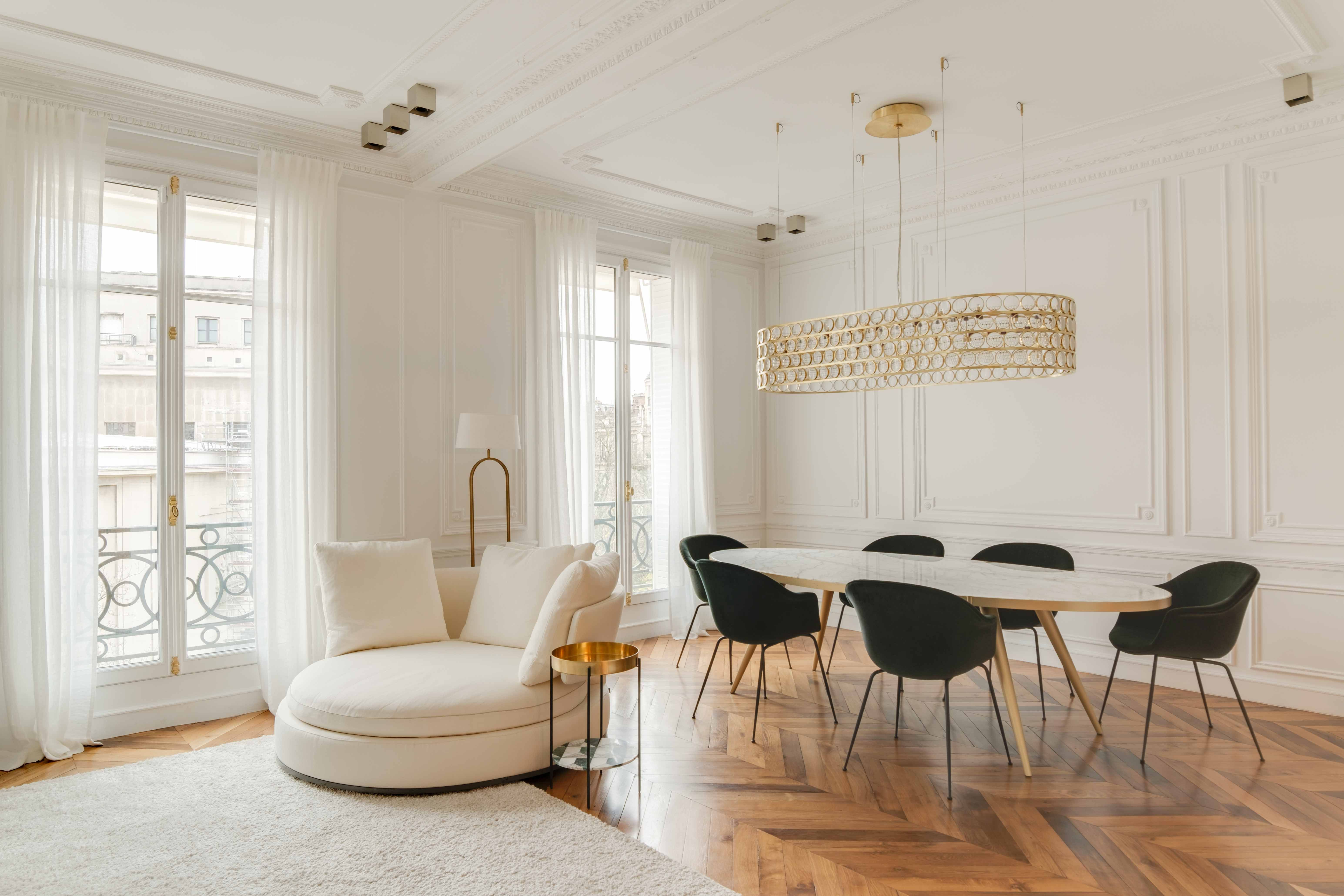
The sofa is a strong colour. Should the curtains pick it up? What about the rug? Do the cushions need to be in the same shade?Creating a harmonious home does not mean coordinating everything.Quite often, it means the opposite.
You have finally chosen the sofa. Terracotta. Beautiful. And then the questions begin.
Should we add a few terracotta cushions to tie it in? Perhaps some terracotta in the rug too? And beige curtains, just to be safe?
It is a very natural instinct: once we find a colour we love, we want to repeat it in order to create harmony. The risk?
That the room slowly begins to feel too coordinated. An interesting interior does not need everything to match perfectly.
It needs colours, materials and textures to feel as though they belong to the same story. And those are two very different things.
Here are five principles to start from.
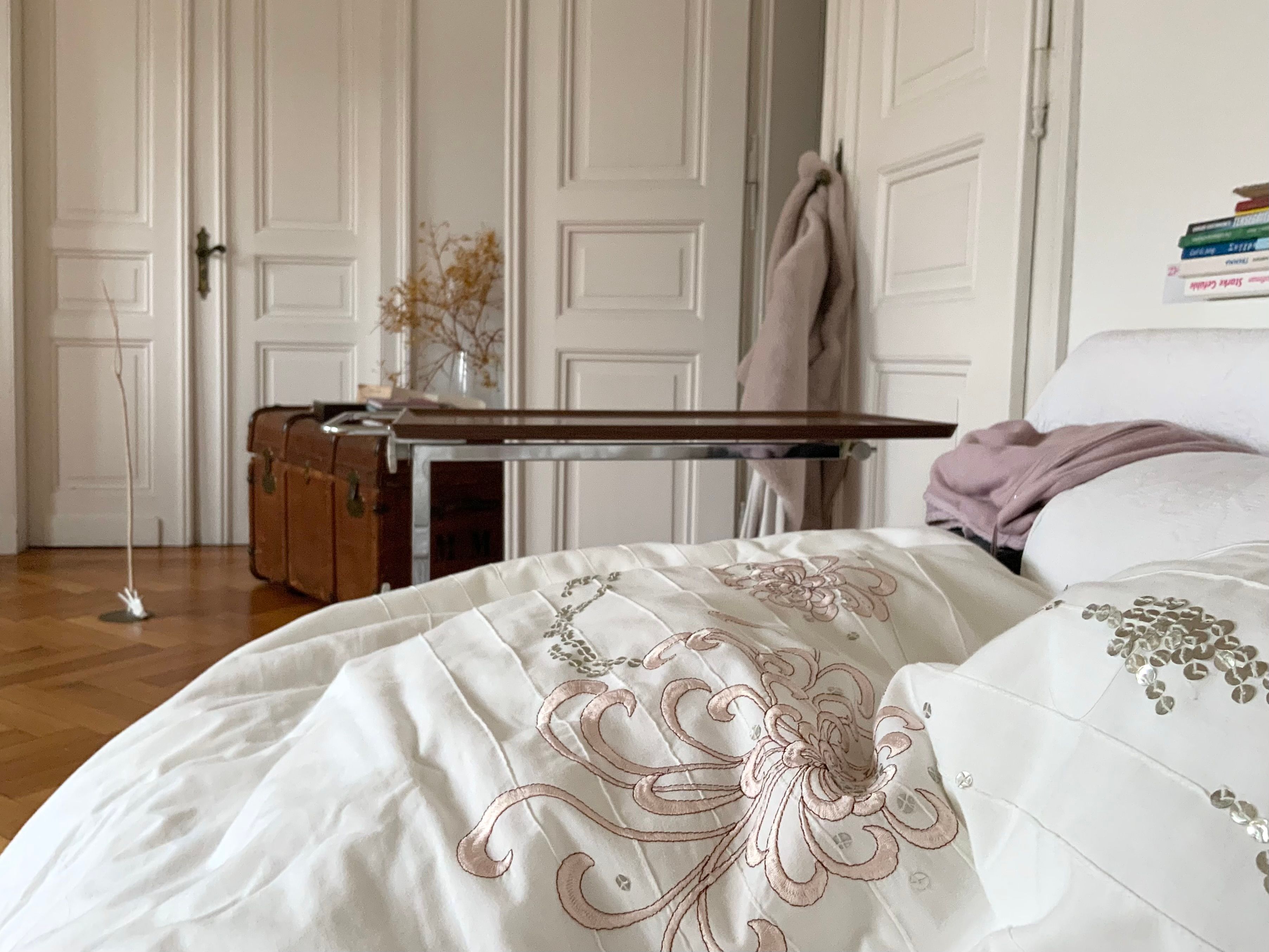
Before choosing a palette, look at the house. But most importantly, look at the things you are not planning to change.
The parquet. The doors. The kitchen. A sofa you have just bought. An important dining table. An existing stone surface. These are the real starting points.
If you have warm-toned flooring and a large terracotta sofa, for example, you already have two significant chromatic elements in the room. Your palette should not ignore them in pursuit of an image saved on Pinterest. It should begin there.
A small tip: photograph the elements that are staying and look at them together, even if they belong to different rooms.
It will help you see which tones are already present in your home before you introduce anything new.
This is probably one of the most common mistakes.You have an olive-green armchair. And you begin searching for: an olive-green cushion. Then an olive-green ceramic piece. Then a pattern containing exactly that same shade. You do not need to.
In fact, the more sophisticated result often comes when a colour returns without ever being exactly the same. An olive green can sit beautifully beside a dustier sage.
A deep blue can reappear in a greyer tone. Terracotta can meet a darker brick red or a muted burnt rose. Think in families, not colour codes. The room will feel deeper and as though it has evolved naturally over time, rather than having been bought all in one afternoon.
Imagine a room with: a statement sofa, a heavily patterned rug, colourful curtains, a painted feature wall, patterned cushions and a highly textured coffee table.
Individually, every element may be beautiful. Together, they are all asking for attention.
And the eye no longer knows where to rest.
A room needs hierarchy.
If the sofa is the main character, perhaps the rug can be quieter. If you have chosen a bold wallpaper, the curtains might support it rather than compete with it. If the rug is antique, richly coloured and already has a strong presence, perhaps you do not need another three decorative statements. Think of the room as a conversation.
If everyone speaks at the same time, no one is really heard. Something can take the lead. The rest should help it.
This is probably the simplest exercise in this article.
And one of the most effective.
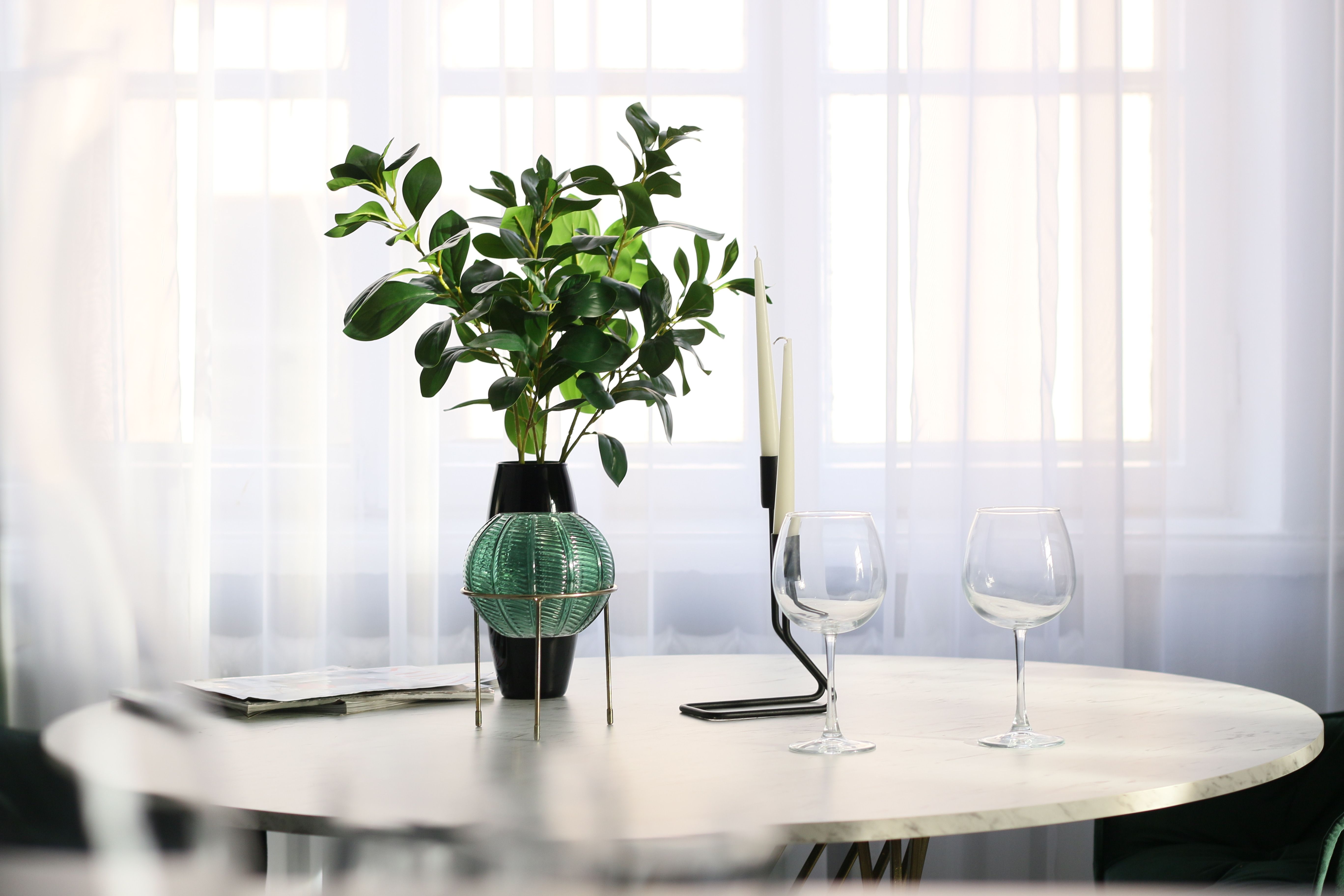
Bring together: the wall colour, a sample of the sofa fabric, the curtain textile, the rug, the main wood tone, any stone and the metal finish you are considering.
Then look at them all together. Not one at a time. Because a beautiful fabric can be perfect on its own and completely wrong beside your flooring.
A seemingly neutral wall colour can suddenly read pink next to the sofa. A timber finish can appear too yellow when it meets the floor. Then do one more thing. Photograph the composition. And step back. Very often, a photograph makes it immediately obvious which element seems to belong to a different story.
When a room is not working, we tend to ask:
“Which colour should I add?”
Try changing the question.
Ask instead:
“What is missing?”
If everything is very pale, perhaps the room needs depth. If everything is warm, perhaps it needs one note to rebalance it. If every surface is smooth and uniform, perhaps what is missing is not another colour.
Perhaps it is texture.
And if the room already contains three very strong elements, perhaps nothing is missing at all. Perhaps something simply needs to be removed. This small shift in perspective can prevent a surprising number of unnecessary purchases.
When we design a room, we never think only in terms of:
ivory + green + brown.
We think more like this:
matte ivory + deep walnut + raw linen + clear glass + satin brass + a small accent of muted green.
Because the way we perceive colour changes with the material. Beige on velvet is not the same beige on a wall. Brown on a glossy ceramic surface does not feel like walnut. Green on linen reads differently from the same green on a lacquered surface. And it is precisely this layering of colour, material and light that brings a palette to life.
We can start with what you already have and build a palette around it — combining colours, materials and textures in a way that gives your home a clear direction without making it feel overly coordinated.
Write to us at info@aqhitalia.com and tell us about your space.




.png)